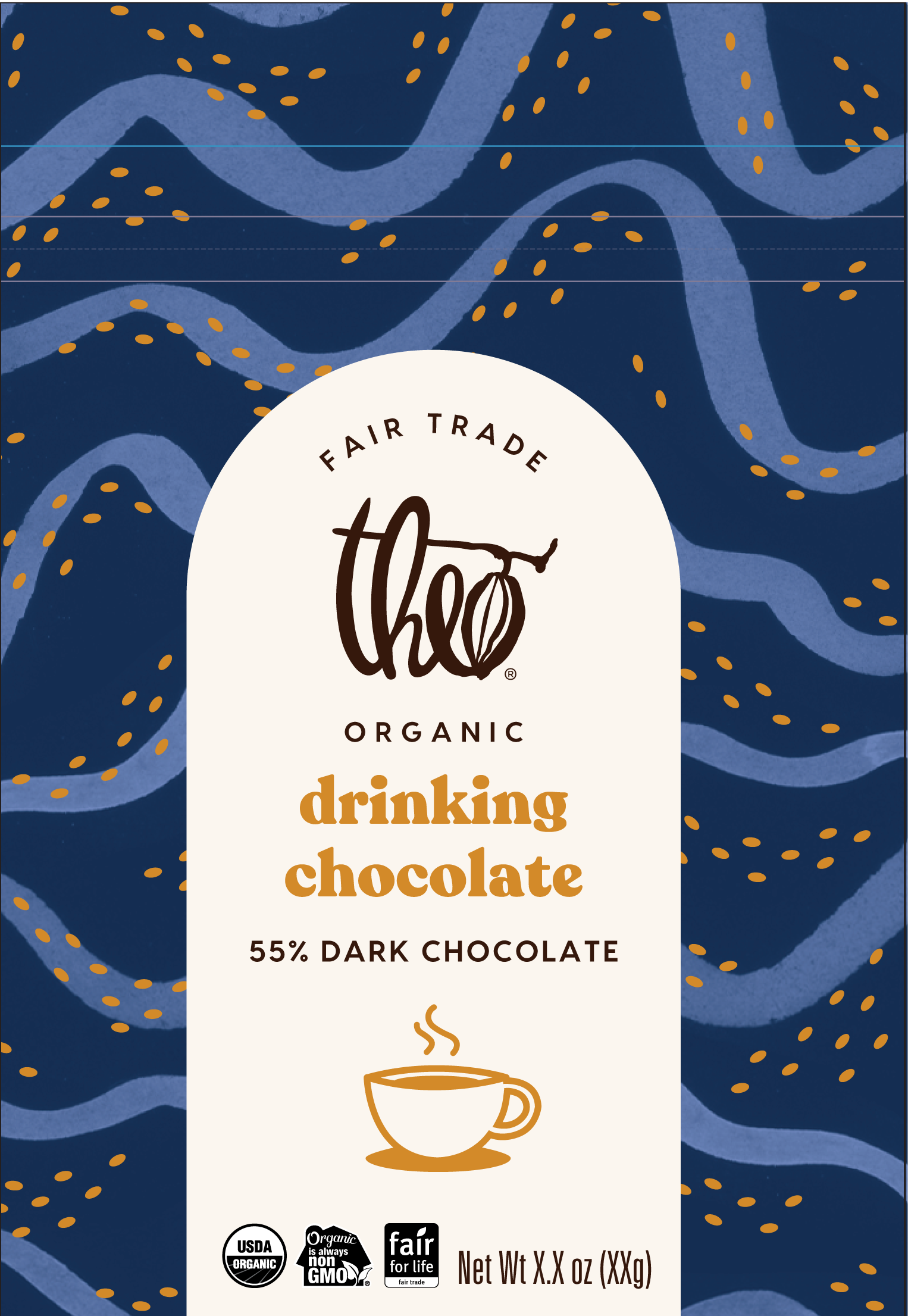
D R I N K I N G C H O C O L A T E
R E D E S I G N
The goal of this redesign was to create packaging that conveys the giftability, indulgence, and unique format of drinking chocolate while fitting within an existing Theo product architecture pillar and sitting nicely alongside Everyday and Holiday products. This item will be available every day; however, it will be retailed with other specialty items and seasonal offerings in the retail store and on TheoChocolate.com. The previous packaging sat in our core packaging architecture pillar but with this redesign, we felt it fit better in our specialty line which includes confection boxes.
first concept
previous packaging
paint stroke exploration
For the redesign, I took the hand mark-making used in the artwork of the specialty line. While the confections used short brush strokes to create the pattern I felt for the drinking chocolate it’d make sense to create long brush strokes that emulated liquid. Using India ink, I created shapes and lines that captured the smoothness of Theo’s drinking chocolate. The palette was taken from the night sky of the Holiday bars. Then, used the gold foil to nod to the chopped chocolate swirled in the milk to make drinking chocolate.
holiday line
specialty line
FINAL PACKAGING
Photography and styling done by me


